Primary / light backgroundsDownload SVG ↓
← Back to the platformA grounded identity for shared participation in real projects, local businesses, and the places people believe in.

Two balanced architectural forms create an open O. The primary logo is solid emerald, with clean geometry and no outline, metallic edge, shadow or effects. Use bone or white for the reverse mark on dark backgrounds.

Emerald anchors the identity. Onyx, bone and stone keep the interface clear. Gold adds a restrained accent to details and highlights. Select a swatch to copy its hex code.
Gold is an accent, not a logo treatment. Use it for small details, dividers and selected highlights. Keep the primary Balanced O and wordmark plain emerald. Use onyx text on gold backgrounds; use emerald or onyx for small text on bone.
Use medium and semibold weights for headlines, with measured spacing and generous room around the message.
Use clear, comfortable body text for explanations, terms, navigation, and financial information.
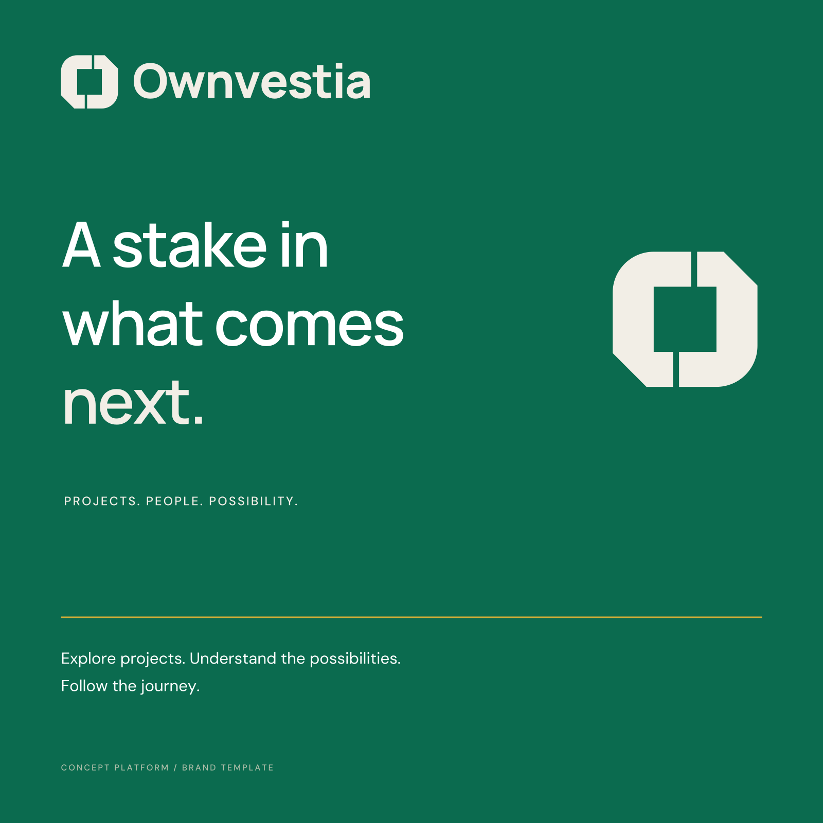
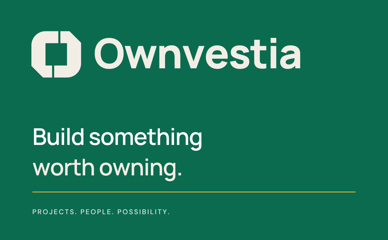
The kit includes scalable logos, transparent PNGs, app icons, editable social artwork, card layout concepts, fonts, and brand tokens.
Exact artwork, practical usage rules, and reusable assets for your next step.